Voxel, May 2012 Template
Incredibly pretty & clean
news or magazine style design
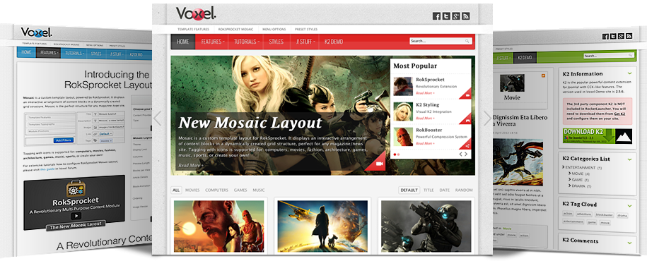
Inside Voxel Template
Everything You Need to Build Your Stunning Website
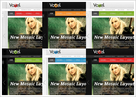
Multiple Preset Styles
Versatile & Flexible Layout
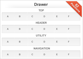
Fashion & Style the Module
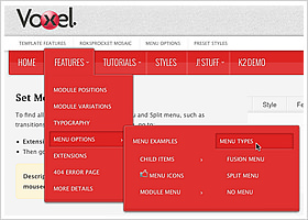
Integrated Powerful Menu System
Make the Content Sexier
RocketTheme Extensions Styled
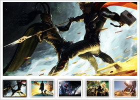
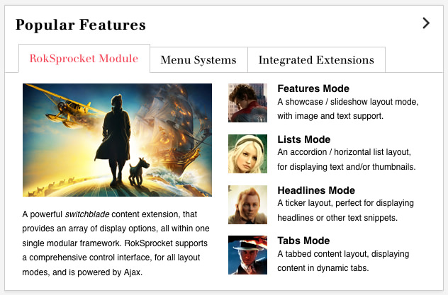
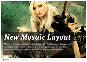
Inclusive RokSprocket Integration
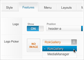
Pick Your Logo From Template Manager
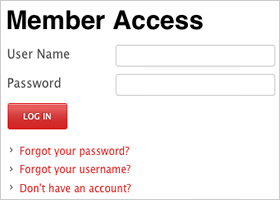
Styled for Regular Joomla! Stuff
Gantry Framework
Powerful Framework that Makes Building Websites Easier
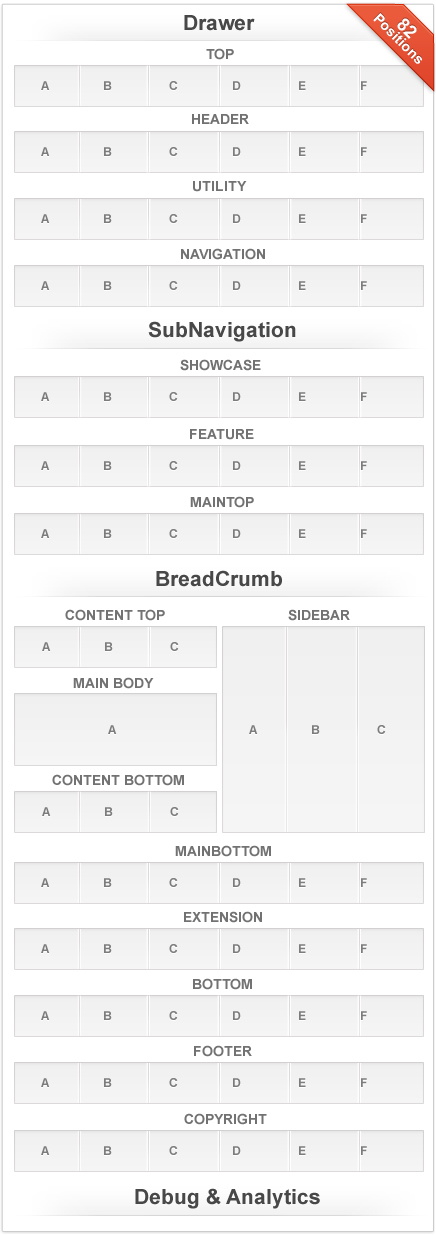
- Compact 960 Grid System
CSS grid framework to construct web content based on a width of 960 pixels
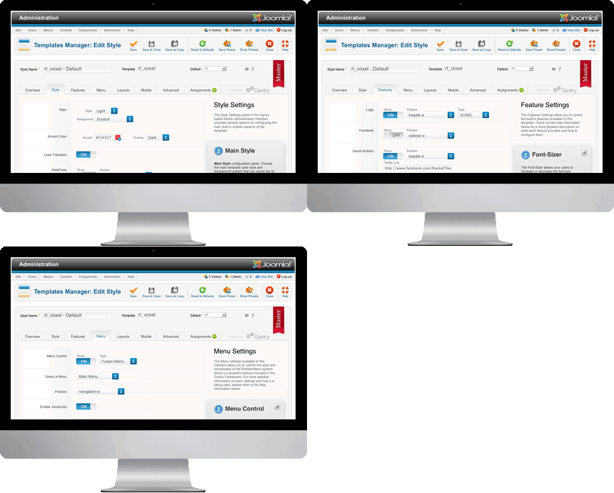
- Stunning Admin Interface
Gantry provides a uniquely intuitive interface to control all aspects of the design
- Per-menu-item Configuration
Powerful feature in Gantry to control configuration on a per-menu-item basis
- Source-Ordered 4 Columns
With up to 3 total sidebars, you can achieve highly complex mainbody layout scenarios
- Integrated Gantry Features
Many built-in features such as font-sizer, Google Analytics, To-Top Smooth Slider, etc
- Grid RTL Support
Built in RTL support which will automatically order the layout to support RTL
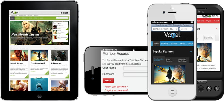
Mobile Support
iPhone, iPad, & Android Custom Mobile Theme Support
There are 11 stylistic module class suffixes, these add a unique style variation to the module: box1-4, title1-6, and lineshadow; and 26 structural suffixes, these affect the layout and metrics of the module.
There are 6 variations to change the module title: title1-6.
An example module using the title1 module class suffix.
More
An example module using the title2 module class suffix.
More
title3
An example module using the title3 module class suffix.
More
title4
An example module using the title4 module class suffix.
More
title5
An example module using the title5 module class suffix.
More
title6
An example module using the title6 module class suffix.
More
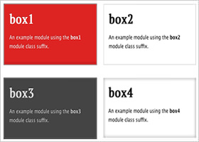
There are 4 variations to change the module background: box1-4.
box1
An example module using the box1 module class suffix.
More
box2
An example module using the box2 module class suffix.
More
box3
An example module using the box3 module class suffix.
More
box4
An example module using the box4 module class suffix.
More
Module Suffix "lineshadow"
lineshadow
An example module using the lineshadow module class suffix.
More
Creating Beautiful Content With Simple Code
Typography is a fundamental part of a template, providing you with the tools to characterise your content and bring it to life. There is a vast array of typography available with Ionosphere template, as is with our previous releases, from list styles, notice blocks and a diverse number of other elements.
If you are using the TinyMCE editor for HTML typography, go to Extensions → Plugin Manager → TinyMCE 2.0 → Set Code Clean-up on Save to Never.
<h1> Heading Styles
H1. Heading 1
H2. Heading 2
H3. Heading 3
H4. Heading 4
H5. Heading 5
H1. Page Title
H1. Content Title
<ul> List Styles
- This is an example of a standard list style. Lorem ipsum dolor sit amet, consectetur adipiscing elit. Donec sit amet nibh.
- This is an example of a standard list style. Lorem ipsum dolor sit amet, consectetur adipiscing elit. Donec sit amet nibh.
- This is an example of a standard list style. Lorem ipsum dolor sit amet, consectetur adipiscing elit. Donec sit amet nibh.
- This is an example of a standard list style. Lorem ipsum dolor sit amet, consectetur adipiscing elit. Donec sit amet nibh.
- This is an example of a standard list style. Lorem ipsum dolor sit amet, consectetur adipiscing elit. Donec sit amet nibh.
<p> DropCap Styles
Praesent rutrum sapien ac felis. Phasellus elementum dolor quis turpis. Vestibulum nec mi vitae pede tincidunt nonummy. Vestibulum facilisis mollis neque. Sed orci. Cum sociis natoque penatibu. Pellentesque vel enim urna, sit amet blandit ipsum. Maecenas quis sem sit amet nunc pretium mattis. Sed dapibus semper est, sed pretium erat.
Use the following format: <p class="dropcap">...</p> (HTML) or [dropcap class="dropcap"]...[/dropcap] (ROKCANDY). You can use any letter, symbol or number.
Praesent rutrum sapien ac felis. Use this format: <p class="dropcap2">...</p> (HTML) or [dropcap class="dropcap2"] ... [/dropcap] (ROKCANDY)
Praesent rutrum sapien ac felis. Use this format: <p class="dropcap3">...</p> (HTML) or [dropcap class="dropcap3"] ... [/dropcap] (ROKCANDY)
Praesent rutrum sapien ac felis. Use this format: <p class="dropcap4">...</p> (HTML) or [dropcap class="dropcap4"] ... [/dropcap] (ROKCANDY)
Praesent rutrum sapien ac felis. Use this format: <p class="dropcap5">...</p> (HTML) or [dropcap class="dropcap5"] ... [/dropcap] (ROKCANDY)
<blockquote> Styles
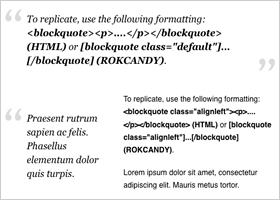
To replicate, use the following formatting: <blockquote><p>....</p></blockquote> (HTML) or [blockquote class="default"]...[/blockquote] (ROKCANDY).
Praesent rutrum sapien ac felis. Phasellus elementum dolor quis turpis.
To replicate, use the following formatting: <blockquote class="alignleft"><p>....</p></blockquote> (HTML) or [blockquote class="alignleft"]...[/blockquote] (ROKCANDY).
Lorem ipsum dolor sit amet, consectetur adipiscing elit. Mauris metus tortor.
Praesent rutrum sapien ac felis. Phasellus elementum dolor quis turpis.
To replicate, use the following formatting: <blockquote class="alignright"><p>....</p></blockquote> (HTML) or [blockquote class="alignright"]...[/blockquote] (ROKCANDY).
Lorem ipsum dolor sit amet, consectetur adipiscing elit. Mauris metus tortor.
<pre> Code Styles
This is a sample <pre class="lines">...</pre> (HTML) or,
[pre2 class="{lines}"] ... [/pre2] (ROKCANDY) tag:

div.modulebox-black div.bx1 {
  background: url(../images/box_bl.png) 0 100% repeat;
}

div.modulebox-black div.bx2 {
  background: url(../images/box_tr.png) 100% 0 repeat;
}
This is a sample <pre>...</pre> (HTML) or,
[pre class="{lines}"] ... [/pre] (ROKCANDY) tag:

div.modulebox-black div.bx1 {
  background: url(../images/box_bl.png) 0 100% repeat;
}

div.modulebox-black div.bx2 {
  background: url(../images/box_tr.png) 100% 0 repeat;
}
<p> Notice Styles
This is a sample of the Approved style. To replicate, use the following syntax: <p class="approved">....</p> (HTML) or [notice class="approved"] ... [/notice] (ROKCANDY).
This is a sample of the Attention style. To replicate, use the following syntax: <p class="attention">....</p> (HTML) or [notice class="attention"] ... [/notice] (ROKCANDY).
This is a sample of the Notice style. To replicate, use the following syntax: <p class="notice">....</p> (HTML) or [notice class="notice"] ... [/notice] (ROKCANDY).
This is a sample of the Alert style. To replicate, use the following syntax: <p class="alert">....</p> (HTML) or [notice class="alert"] ... [/notice] (ROKCANDY).
<span> Text Icon Styles
To replicate, the following format: <span class="text-icon iconname">...</span> (HTML) or [icon class="icon name"]...[/icon] (ROKCANDY). The class names are listed below, such as "text-icon email".
Text with an email icon
Text with a phone icon
Text with a quote icon
Text with a cart icon
Text with a tags icon
Text with a write icon
Text with an info icon
Text with a sound icon
Text with a rightarrow icon
Text with a leftarrow icon
Text with a circlearrow icon
Text with a downarrow icon
Text with an uparrow icon
Text with a person icon
Text with a calendar icon
Text with a doc icon
Text with a bulb icon
Text with a youtube icon
Text with a skype icon
Text with a facebook icon
Text with a like icon
Text with a video icon
Text with a dropbox icon
Text with a vimeo icon
Text with a paypal icon
<em> Emphasis Styles
This is a emphasis tag that allows you to highlight words or phrases. Use the following format: <em class="italic">...</em> (HTML) or [emphasis]...[/emphasis] (ROKCANDY)
This is a emphasis tag that allows you to highlight words or phrases. Use the following format: <em class="bold">...</em> (HTML) or [emphasisbold]...[/emphasisbold] (ROKCANDY)
This is a emphasis tag that allows you to highlight words or phrases. Use the following format: <em class="bold2">...</em> (HTML) or [emphasisbold2]...[/emphasisbold2] (ROKCANDY)
This is a emphasis tag that allows you to highlight words or phrases. Use the following format: <em class="highlight">...</em> (HTML) or [highlight class="default"]...[/highlight] (ROKCANDY)
This is a emphasis tag that allows you to highlight words or phrases. Use the following format: <em class="highlight white">...</em> (HTML) or [highlight class="white"]...[/highlight] (ROKCANDY)
This is a emphasis tag that allows you to highlight words or phrases. Use the following format: <em class="highlight black">...</em> (HTML) or [highlight class="black"]...[/highlight] (ROKCANDY)
This is a emphasis tag that allows you to highlight words or phrases. Use the following format: <em class="highlight green">...</em> (HTML) or [highlight class="green"]...[/highlight] (ROKCANDY)
This is a emphasis tag that allows you to highlight words or phrases. Use the following format: <em class="highlight yellow">...</em> (HTML) or [highlight class="yellow"]...[/highlight] (ROKCANDY)
This is a emphasis tag that allows you to highlight words or phrases. Use the following format: <em class="highlight blue">...</em> (HTML) or [highlight class="blue"]...[/highlight] (ROKCANDY)
This is a emphasis tag that allows you to highlight words or phrases. Use the following format: <em class="highlight red">...</em> (HTML) or [highlight class="red"]...[/highlight] (ROKCANDY)
To replicate, use the following format: <ul class="list-icon icon_name"><li>....</li><li>....</li>...</ul> (HTML) or [list class="list-icon icon_name"][li]....[/li][li....[/li][/list] (ROKCANDY). The icon names are listed below, such as "cart".
- A list item using the list-icon email class.
- A list item using the list-icon email class.
- A list item using the list-icon phone class.
- A list item using the list-icon phone class.
- A list item using the list-icon quote class.
- A list item using the list-icon quote class.
- A list item using the list-icon youtube class.
- A list item using the list-icon youtube class.
- A list item using the list-icon facebook class.
- A list item using the list-icon facebook class.
- A list item using the list-icon cart class.
- A list item using the list-icon cart class.
- A list item using the list-icon write class.
- A list item using the list-icon write class.
- A list item using the list-icon info class.
- A list item using the list-icon info class.
- A list item using the list-icon sound class.
- A list item using the list-icon sound class.
- A list item using the list-icon rightarrow class.
- A list item using the list-icon rightarrow class.
- A list item using the list-icon skype class.
- A list item using the list-icon skype class.
- A list item using the list-icon leftarrow class.
- A list item using the list-icon leftarrow class.
- A list item using the list-icon circlearrow class.
- A list item using the list-icon circlearrow class.
- A list item using the list-icon dropbox class.
- A list item using the list-icon dropbox class.
- A list item using the list-icon vimeo class.
- A list item using the list-icon vimeo class.
- A list item using the list-icon downarrow class.
- A list item using the list-icon downarrow class.
- A list item using the list-icon video class.
- A list item using the list-icon video class.
- A list item using the list-icon like class.
- A list item using the list-icon like class.
- A list item using the list-icon uparrow class.
- A list item using the list-icon uparrow class.
- A list item using the list-icon person class.
- A list item using the list-icon person class.
- A list item using the list-icon calendar class.
- A list item using the list-icon calendar class.
- A list item using the list-icon bulb class.
- A list item using the list-icon bulb class.
- A list item using the list-icon paypal class.
- A list item using the list-icon paypal class.
- A list item using the list-icon doc class.
- A list item using the list-icon doc class.
These list styles are based on the latest CSS3 techniques and are designed to work in modern browsers (will not display properly in IE6-IE8).
To replicate, use the following format: <ul class="class name"><li>....</li><li>....</li>...</ul> (HTML) or [list class="class name"][li]....[/li][li....[/li][/list] (ROKCANDY). The class names are listed below, such as "checkmark red".
- Circle-Checkmark
- Circle-Checkmark
- Square-Checkmark
- Square-Checkmark
- Checkmark Green
- Checkmark Green
- Checkmark Yellow
- Checkmark Yellow
- Checkmark Red
- Checkmark Red
- Checkmark Blue
- Checkmark Blue
- Checkmark White
- Checkmark White
- Triangle-Small
- Triangle-Small
- Triangle-Large
- Triangle-Large
- Triangle Green
- Triangle Green
- Triangle Yellow
- Triangle Yellow
- Triangle Red
- Triangle Red
- Triangle Blue
- Triangle Blue
- Triangle White
- Triangle White
- Circle-Small
- Circle-Small
- Circle-Large
- Circle-Large
- Circle Green
- Circle Green
- Circle Yellow
- Circle Yellow
- Circle White
- Circle White
Praesent rutrum sapien ac felis. Phasellus elementum dolor quis turpis. Vestibulum nec mi vitae pede tincidunt nonummy. Vestibulum facilisis mollis neque. Sed orci. Cum sociis natoque penatibus et magnis dis parturient montes, nascetur ridiculus mus.
Inset Right TitleYou will need to use the following formatting: <span class="inset-right"> <span class="inset-right-title"> .... </span> ... some content ... </strong> (HTML) or [inset side="right" title="Inset Right Title"] ... some content ...[/inset] (ROKCANDY)
Vestibulum facilisis mollis neque. Sed orci. Cum sociis natoque penatibus et magnis dis parturient montes, nascetur ridiculus mus. Sed euismod magna a nibh.
Praesent rutrum sapien ac felis. Phasellus elementum dolor quis turpis. Vestibulum nec mi vitae pede tincidunt nonummy. Vestibulum facilisis mollis neque. Sed orci. Cum sociis natoque penatibus et magnis dis parturient montes, nascetur ridiculus mus.
Inset Left TitleYou will need to use the following formatting: <span class="inset-left"> <span class="inset-left-title"> .... </span> ... some content ... </strong> (HTML) or [inset side="left" title="Inset Left Title"] ... some content ...[/inset] (ROKCANDY)
Vestibulum facilisis mollis neque. Sed orci. Cum sociis natoque penatibus et magnis dis parturient montes, nascetur ridiculus mus. Sed euismod magna a nibh.
Sed euismod magna a nibh. Praesent rutrum sapien ac felis. Phasellus elementum dolor quis turpis. Vestibulum nec mi vitae pede tincidunt nonummy. Praesent rutrum sapien ac felis. Phasellus elementum dolor quis turpis. Vestibulum nec mi vitae pede tincidunt nonummy. Vestibulum facilisis mollis neque.
Cum sociis natoque penatibus et magnis dis parturient montes, nascetur ridiculus mus.Praesent rutrum sapien ac felis. Phasellus elementum dolor quis turpis. Vestibulum nec mi vitae pede tincidunt nonummy. Vestibulum facilisis mollis neque. Sed orci. Cum sociis natoque penatibus et magnis dis parturient montes, nascetur ridiculus mus.
RokNavMenu is the core of all the powerful Voxel menu system. Please ensure you are using the latest version of RokNavMenu, available here.
Fusion Menu is a menu theme of the RokNavMenu extension, the addon that drives all RocketTheme template menus. It is primarily a javascript enhanced CSS dropdown menu, that combines standard suckerfish type functionality with animations, transitions and other advanced effects powered by Mootools.
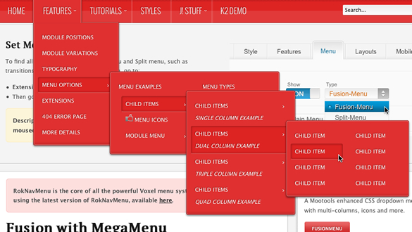
A static menu system that displays 1st and 2nd level items in the main horizontal menu and further children in the Sidebar.
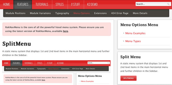
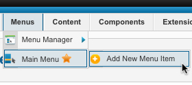
All Menu Items can be edited from Admin → Menu → Menu Name → Menu Item.
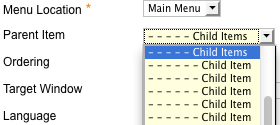
How to create Child Menu Items
Go to Admin → Menu → A Menu → A Menu Item → Select a Parent Item, and it will appear as a child of it.